Time for my annual round up of the Chelsea Flower Show! Bit late this year, as I just haven’t had the time up until now, but actually it’s good to take a moment to look back at the hundreds of photos I took at the time, and see what still stands out.
There were 3 things that struck me about this year’s show – loads of lupins, loads of domed hedging plants (beech, box, yew) and the lack of garden pavilions! In recent years it has appeared de rigueur to have a building/pavilion/structure in every show garden. This year everything seemed a little bit simpler.
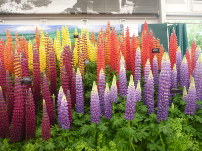
And it was nice to see so many lupins on show – beautiful to look at, but a pain to grow in my experience as the slugs and snails always get to them first! Still, the Chelsea Flower Show is an idealised version of the garden world, with no such things as slugs and snails, so lupins abounded this year. And clipped domes cropped up everywhere, but were lovely nonetheless.
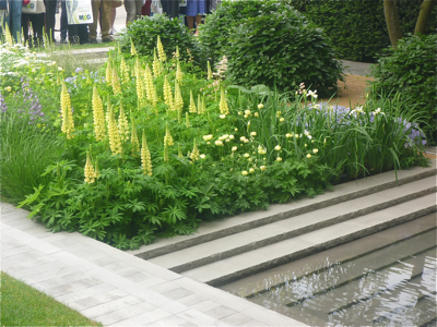
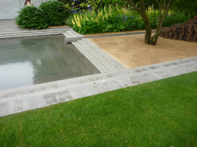
Luciano Giubbilei deservedly won ‘Best in Show’ for his Laurent-Perrier Garden which was a very stylish number with simple geometric shapes. I particularly liked the textural contrasts in the beautiful marble stonework (and the gorgeous Lupin ‘Chandelier’ and clipped domes of Beech).
The Telegraph Garden by del Buono Gazerwitz was probably my favourite this year.
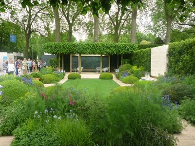
Again, another simple geometric design, with lots of space to see the beautiful planting. The colour palette was very restrained and the overall effect was very calm and classy. Lime trees which were ‘roof-trained’ and domes of clipped box provided structure.
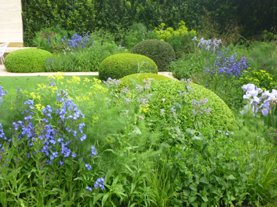
As a complete contrast, the Positively Stoke on Trent garden was very slick and contemporary.
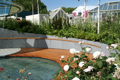
I really liked the curving wall and seat, and the landscaping was beautifully implemented.
A simple, but nicely executed garden was designed by Patrick Collins for the Neonatal unit at St George’s Hospital.
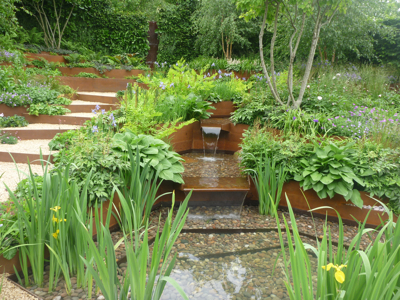
The garden was built on a slope using Corten steel to create steps and a really nice water fall. Planting was simple and effective – and the beauty of it being a sloping garden was that it was easy for visitors to see everything, which is often a problem with the larger gardens as mere mortals aren’t allowed into them to take a proper look around.
One garden which did have a building this year was the Homebase Garden designed by Adam Frost. And a very nice building it was too – an open-sided oak and stone arbour, complete with a wildlife-friendly green roof and a fireplace.
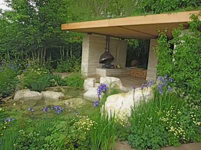
It was a very appealing space, and as the garden was designed ‘to encourage us to stop and spend quality time with each other’, I’d say it fulfilled the brief very well.
Along with the lupins, another key plant in many gardens this year was Iris sibirica which is a great favourite of mine. Iris were planted en masse to represent a channel of water in Hugo Bugg’s Waterscape Garden.
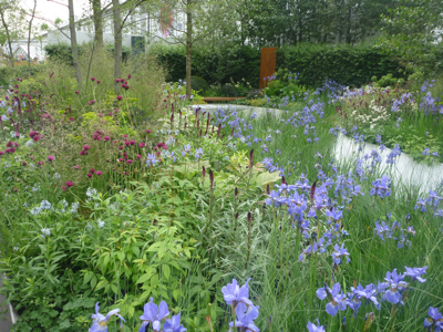
And the very beautiful wine red spikes of Lysimachia atropurpurea ‘Beaujolais’ are always a welcome sight. The cast concrete paving was really effective too – and a very clever way to represent sun-baked cracked ground.
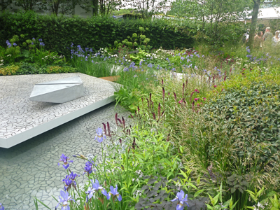
In the ‘Fresh Gardens’ section of the show I particularly liked the Well Child Garden by Olivia Kirk.
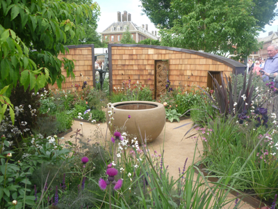
She had designed a wonderful curving cedar shingle wall and the planting complemented the bronze colour of the hard landscaping really well. After seeing so much blue, green and white elsewhere, this made a refreshing change!
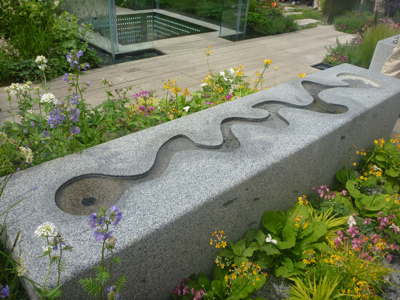
In the RNIB sensory garden I was very taken with the use of granite – cut as plank paving for a clean contemporary look, but also used to create a simple but really attractive water feature which would be at home in pretty much any garden.
When I analyse many of the planting schemes at Chelsea, it’s pretty obvious that if they were transplanted to a real garden they wouldn’t work for more than a few weeks at most. They are designed to look fantastic for a week – and they always do – but on the whole use way too many plants in a small space.
But there’s no denying that it’s a brilliant event to see new plants, great planting combinations and top quality garden design, and the point is (I think) it’s an event to inspire us, so whether it’s realistic or not, it’s a show I feel I can’t miss!
Picture credits: Janet Bligh

