I love my annual pilgrimage to the Chelsea Flower Show, and even though it’s a long, tiring (and this year, cold!) day, it’s just great to spend hours and hours absorbing the work of other garden designers and seeing what our specialist nurseries have to offer.
2013 has been such a difficult year weather-wise, so I was particularly interested to see what sort of planting would be on show. There’s no doubt there was an abundance of cow parsley and aquilegias in an awful lot of gardens, but that’s no bad thing – my own garden is full of both at the moment!
Here’s a quick round-up of what caught my eye this year.
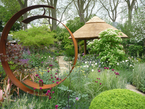
The first garden I came across was Roger Platt’s ‘The M&G Centenary Garden’ which was designed to celebrate 100 years of the Chelsea Flower Show and meant to ‘capture the design trends and themes of shows past and present’. As always, Roger’s planting was stunning, and I was particularly taken with the rusted steel sculpture which framed views down the garden so successfully. Nice one Roger!
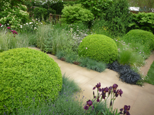
The contrast between the structure of the box balls and the softer planting, together with the smooth paving in the more modern part of the garden, was particularly nice to see.
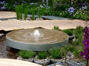
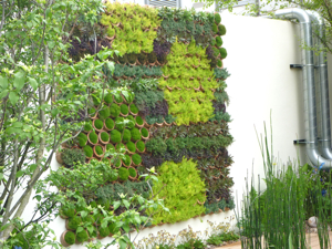
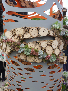
The RBC Blue Water Roof Garden was designed by Professor Nigel Dunnett and reflects his ecological approach to garden and landscape design. This garden illustrated how a roof garden can not only look great but can (should?) be designed with water management in mind. The ‘garden springs’ (above) feed the surrounding garden wetland, and the living wall (below) is made up of reclaimed clay pipes planted with succulents.
Christopher Bradley-Hole is a designer I really admire. His gardens are always so well executed, but they don’t always appeal to the more traditional gardeners who visit Chelsea and who think gardens should be packed full of pretty flowers!
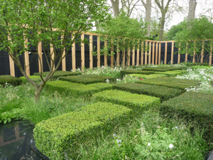
His designs are quite masculine, and often very geometric, and this year’s Telegraph Garden was no exception. It was ‘inspired by three elements: the making of the English landscape, the Japanese approach to garden-making and modern abstract art’.
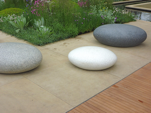 I love these pebble seats which pop up quite often at Chelsea! This year they were used in The Brewin Dolphin Garden and made a lovely contrast to the decking and smooth paving.
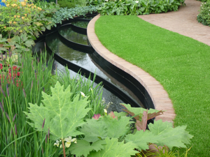
Water is always an important element at Chelsea, and I thought this curving reflective stream in the East Village Garden was very effective.
In the ‘Fresh’ section of the show, the central sculptural feature had been put to good use with this lovely Urban Bee Hotel by Amy Curtis. Something to try at home?
Rusted steel has been used a lot at Chelsea over recent years, but I don’t have a problem with that at all. I think it’s a great material to use amongst planting as it works so well as a backdrop. The SeeAbility Garden had a really nice metal sculptural screen and the paths made of slate on edge were very attractive.
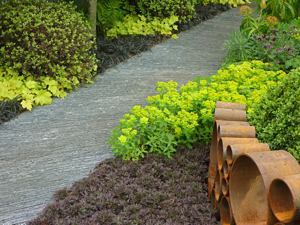
Plus it was good to see some fresh block planting focusing on foliage colour and texture as a contrast to all the Cow parsley & Aquilegia elsewhere in the show!!
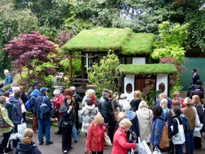
My two favourite show gardens were at opposite ends of the scale to each other. Once again, Japanese landscape designer Ishihara Kazuyuki came up trumps, this year with his exquisitely detailed Tokonoma Garden in the ‘Artisan’ area of the show.

It was so beautiful, with waterfalls, moss, ferns, Acers and a gorgeous Japanese tatami room complete with green roof. It really makes you wonder how on earth they put together something so intricate in the two week build-up period to the show.
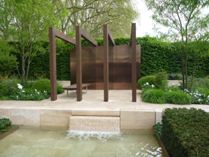
At the other end of the spectrum, was the Laurent Perrier Garden by Swedish landscape designer Ulf Nordfjell. I admire the simplicity of his designs and thought the use of limestone, oak and copper in this garden was really stunning.
Can’t wait till next year!
Photos: Janet Bligh Garden Designs



Urban bee hotel looks amazing 🙂 I think it would look very nice as a decoration in every garden.
I know, it’s lovely isn’t it? Just goes to show that wildlife-friendly gardens can look great too – they don’t have to be wild and unkempt!