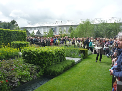
I went to the Chelsea Flower Show twice this year – once on Press Day and then again later in the week as a paying visitor. Seems a bit OTT I guess, but I really enjoy going twice as both trips have their advantages. The obvious upside to Press Day is the lack of crowds and the fact that you can see everything without fighting to get to the front of the throng. But I do enjoy going when the show is open as there’s so much more atmosphere. And there’s such a lot to take in that I always see something new on my second visit.

And this year it felt like there was more variety than usual in the style of gardens on show. Probably because two of the main gardens did something a little different – they weren’t perfect! There were seedheads, dead leaves and patches of bare earth and they just seemed altogether more realistic and made a refreshing change from all that stunning perfection which we’re so used to seeing at Chelsea!
The Best Show Garden award went to Dan Pearson for the Laurent-Perrier Chatsworth Garden which was incredibly well put together.
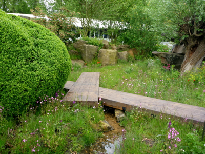
The landscaping and attention to detail was so convincing, it really did feel like a wild garden. With enormous rock formations, a natural stream and wonderful planting, it was a fantastic achievement.

Another gold medal winner which I really liked was A Perfumer’s Garden in Grasse by L’Occitane, designed by James Basson.

This was such an evocative garden that you really did feel like you were in the south of France (or at least you did when the sun came out!). It was beautifully put together.

Most of the main show gardens were stuffed to the gills with gorgeous planting, and perfect hard landscaping as is par for the course at Chelsea.

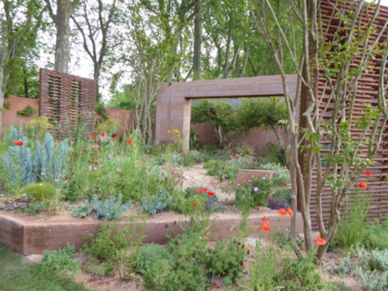
I liked Chris Beardshaw’s planting and the steel wall panels he incorporated into the Morgan Stanley Healthy Cities Garden.

The Brewin Dolphin Garden by Darren Hawkes featured more than 40,000 hand-cut pieces of slate which were used to create steps and suspended platforms. Talk about attention to detail! The woodland planting was beautifully done too, and the overall effect very cool and calm.

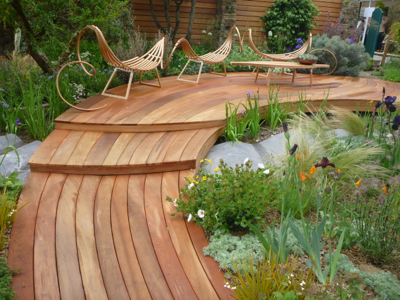
Matthew Wilson’s Royal Bank of Canada garden featured some lovely curving decking and stylish furniture.
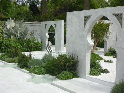
The cool simplicity of the Beauty of Islam garden by Kamelia Bin Zaal was a lovely contrast to a lot of show gardens where there’s so much going on you sometimes don’t know where to look. Like the Provencal garden this really came to life in the sunshine.
I liked Adam Frost’s Homebase Garden – Urban Retreat.

It had quite a simple overall design with strong lines, and repetition through shapes and planting, and an open feel. It felt like a really comfortable space. Lovely timber pavilion too.

The Fresh Gardens section is billed as the ‘cutting-edge face’ of the Chelsea Flower Show. I find some of the gardens just a little too cutting-edge for my tastes but there are often interesting elements to admire (!).
The World Vision garden by John Warland was really striking with planting boxes set into a large reflective pool.

Dark water pools were also used to good effect in the Breathrough Breast Cancer garden by Ruth Willmott. They provided a really good contrast with the soft planting which was predominantly pink, green and white.

In the plant marquee there’s always such a lot too see it can be a bit overwhelming.
I’m not a massive fan of Chrysanthemums but enjoyed the striking ice-cream cones on display by the National Chrysanthemum Society.

My favourite in the marquee this year was something close to my heart – Time for Tea by Interflora. It was a really clever design and ‘inspired by the nation’s love of a good cuppa’.
 I’ll drink to that!
Photo credits: Janet Bligh


What a great post, thanks Janet. Especially love the ice-creams, teapot and cupcakes, and the Islamic garden – those horseshoe-shaped arches are typical of the Moorish architecture here in Andalucia. Such a beautiful shape!
Thanks Fiona. It was a good show this year and great to see something a bit different. The tea display was very clever!